马上注册,结交更多好友,享用更多功能,让你轻松玩转社区。
您需要 登录 才可以下载或查看,没有账号?立即注册

x
LOFT中国感谢来自 建筑营设计工作室 的办公楼项目案例分享:
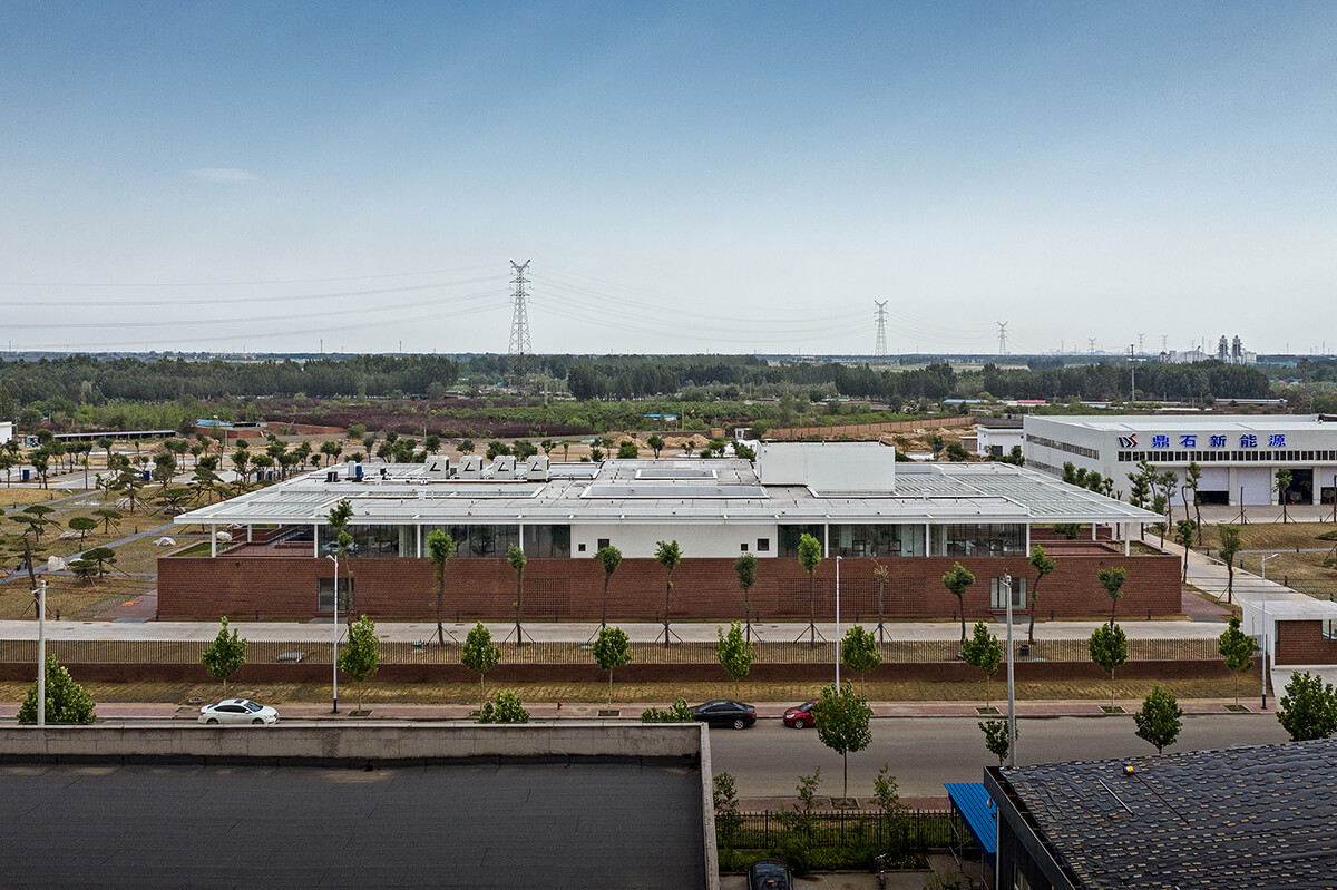
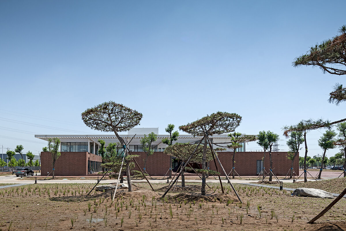
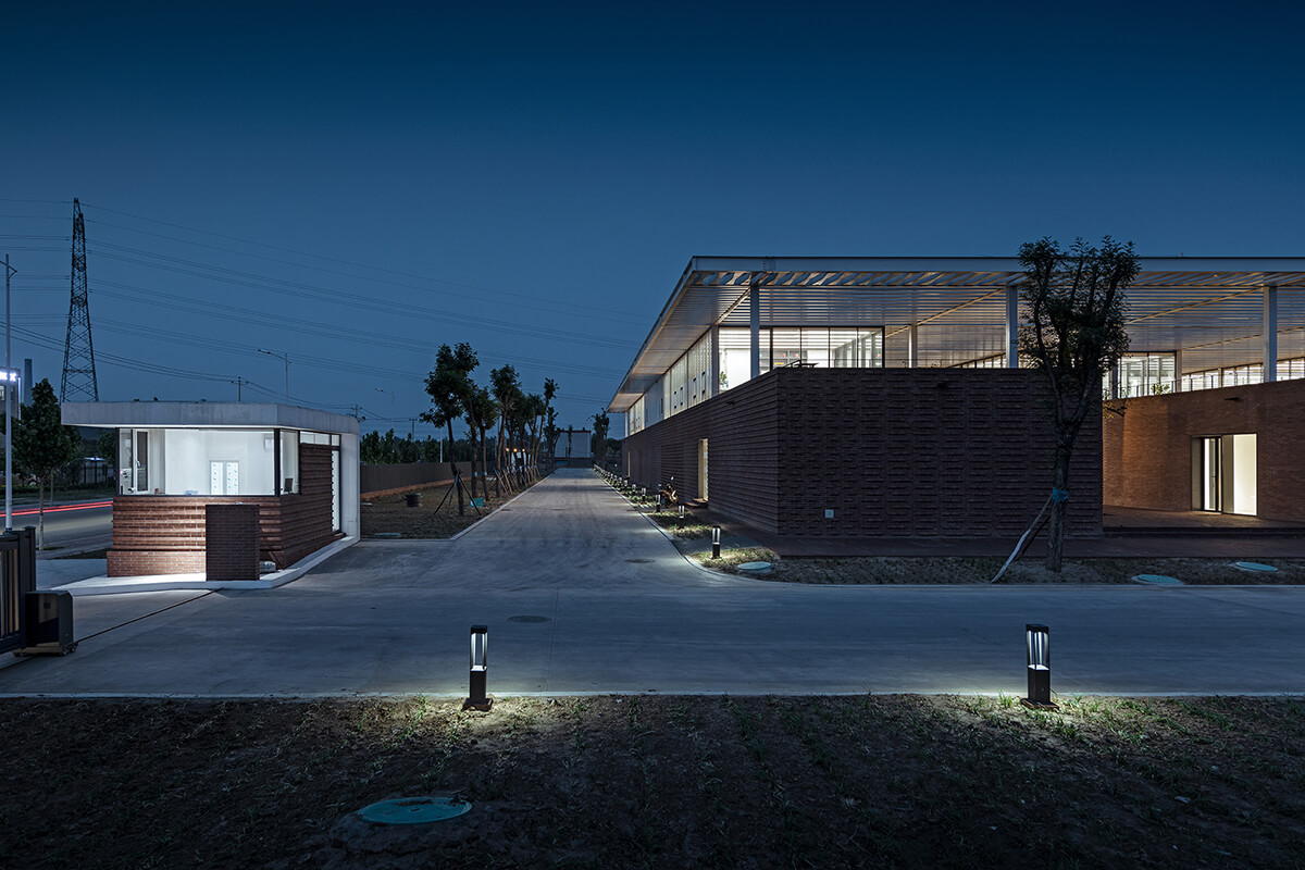
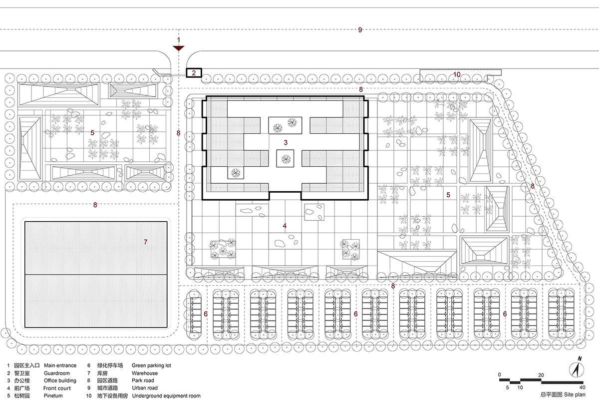
该项目位于市郊一处工业厂房区域之中。园区场地空旷平整,北侧比邻市政道路,南侧是城市尚未开发的空地。办公楼被规划于园区的中部,东西两侧分布着由松林、草坪、步道组成的庭院,南侧留下一片宽阔的前广场以及停车场。
The project is an office building of a logistics company, located in an industrial park on the outskirts of a city in Northern China. The industrial park occupies a plain and expansive land area, which is adjacent to an urban road on the north and next to an unexploited urban land on the south. The office building was planned to sit at the middle of the industrial park, with pine trees, lawns and footpaths forming gardens on its north and west sides, while on the south side is a wide front court and a parking lot.
办公楼东西长约85米,宽约50米,占地面积约8000平米,水平铺展开于场地之中。在相对宽松的用地条件下,设计充分围绕着院落关系组织建筑空间布局,结合功能需求和流线路径产生内外之间多样的场景,营造阳光、绿色、充满活力的工作环境。
The architecture is 85 meters long and 50 meters wide, stretching in east-west direction on a site of about 8,000 square meters. Considering the site is relatively large, ARCHSTUDIO planned the layout of architectural spaces by incorporating courtyards, and created various indoor and outdoor scenes based on functional needs and circulation routes, thereby produced a light-filled, green and vigorous working environment.


1、水平性空间
I. Horizontal space
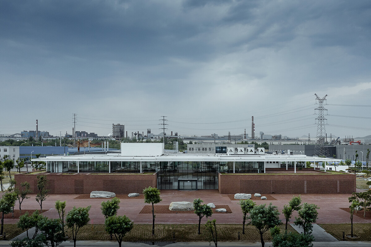
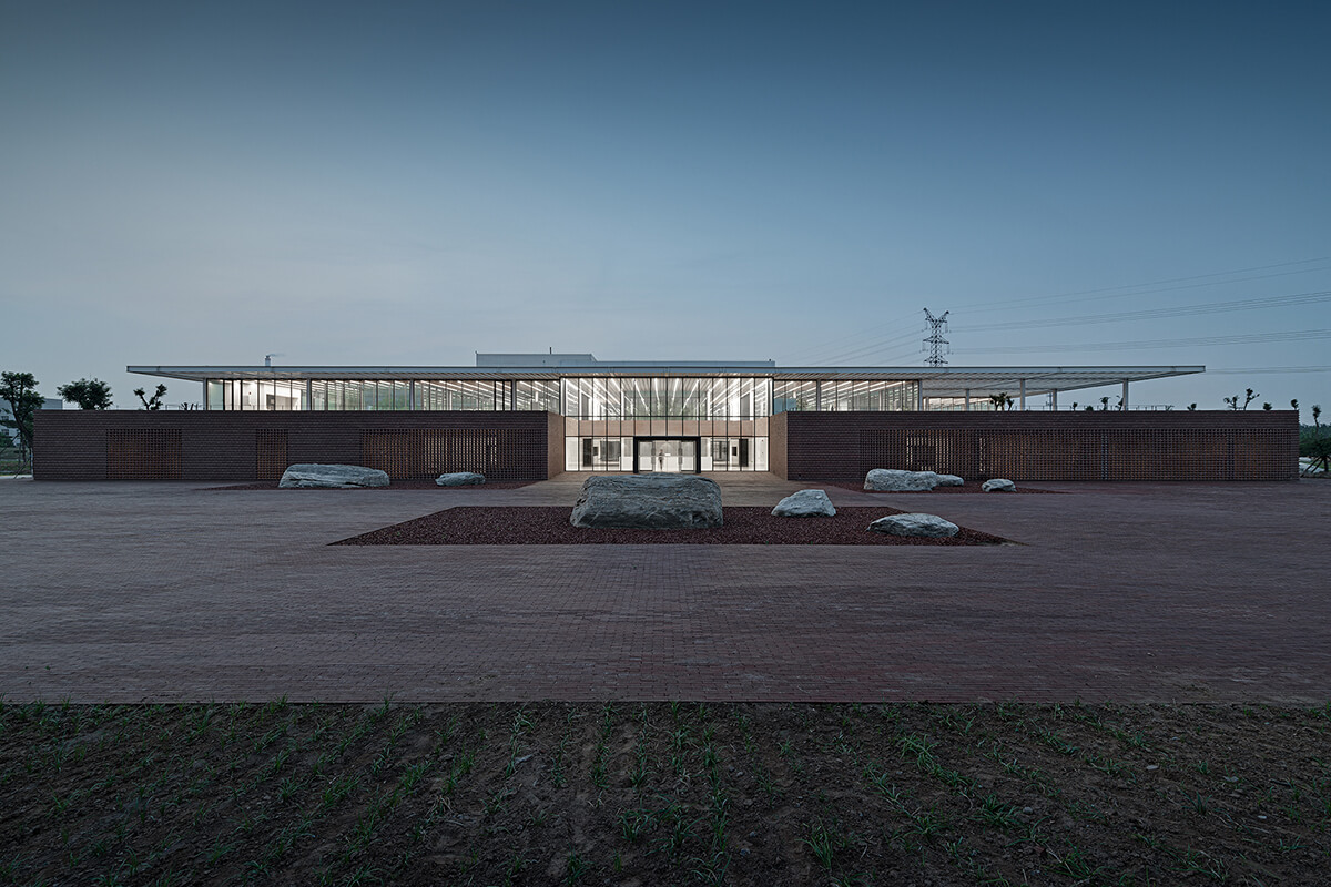
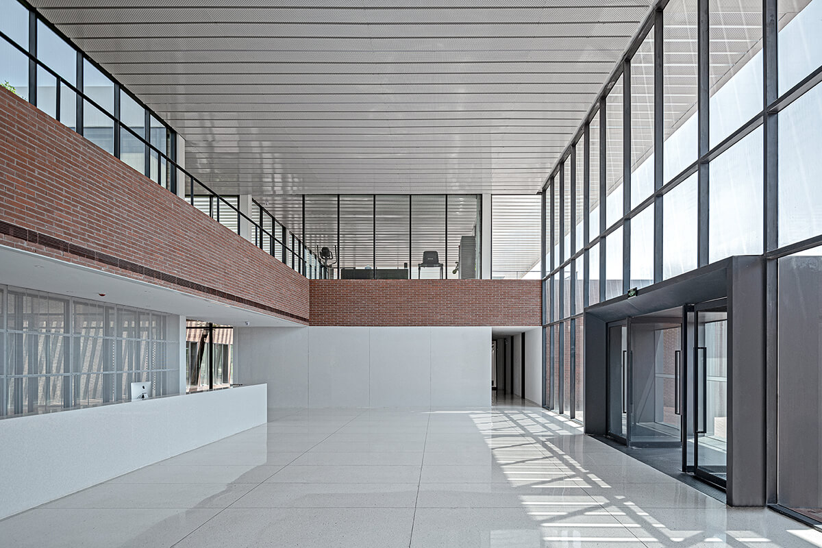
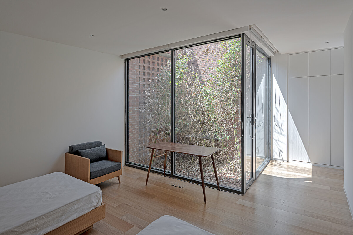
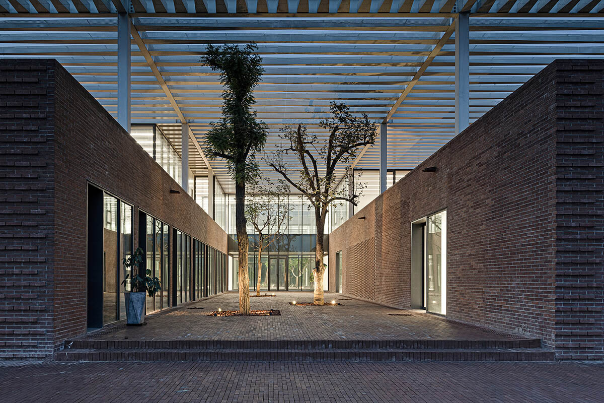
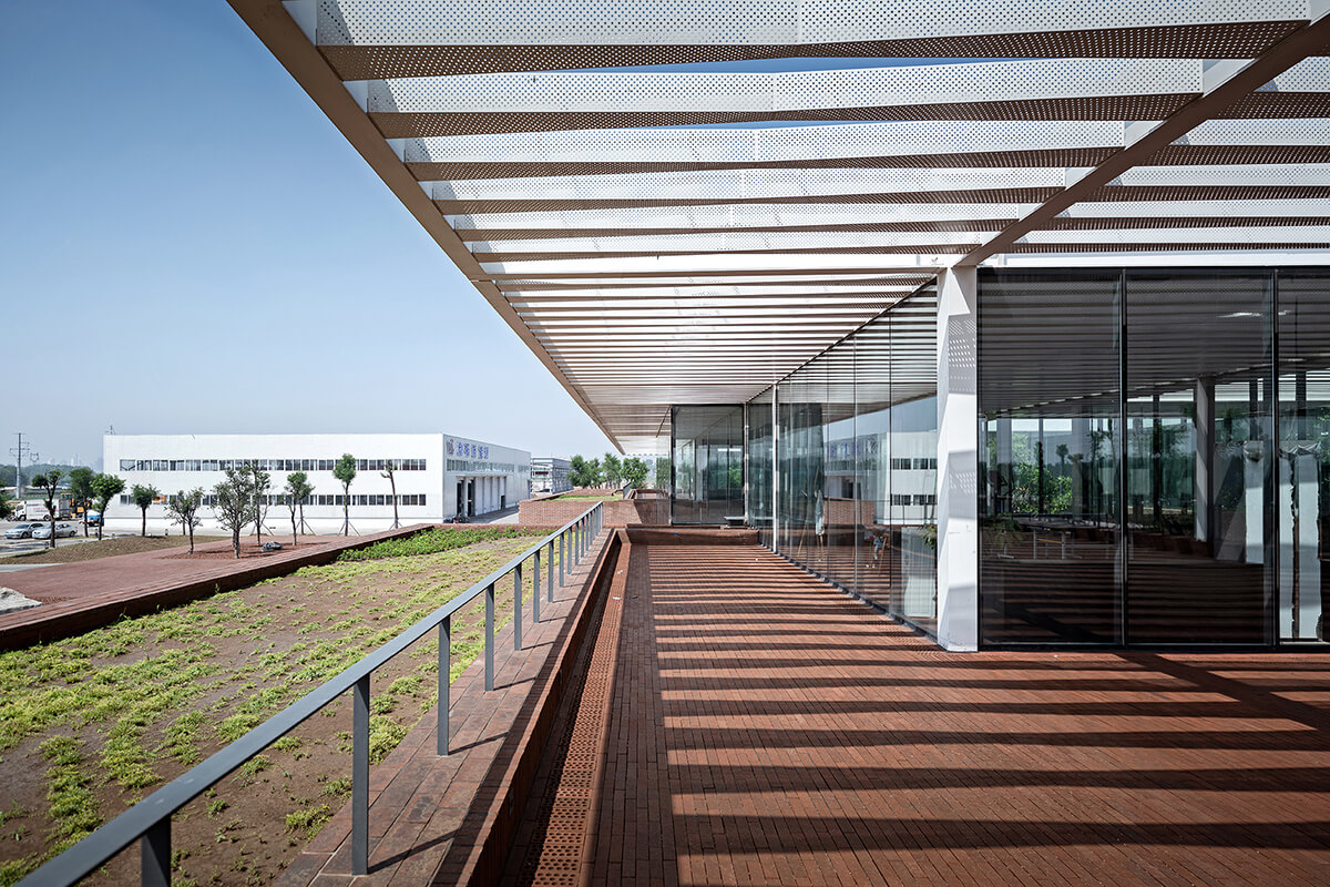
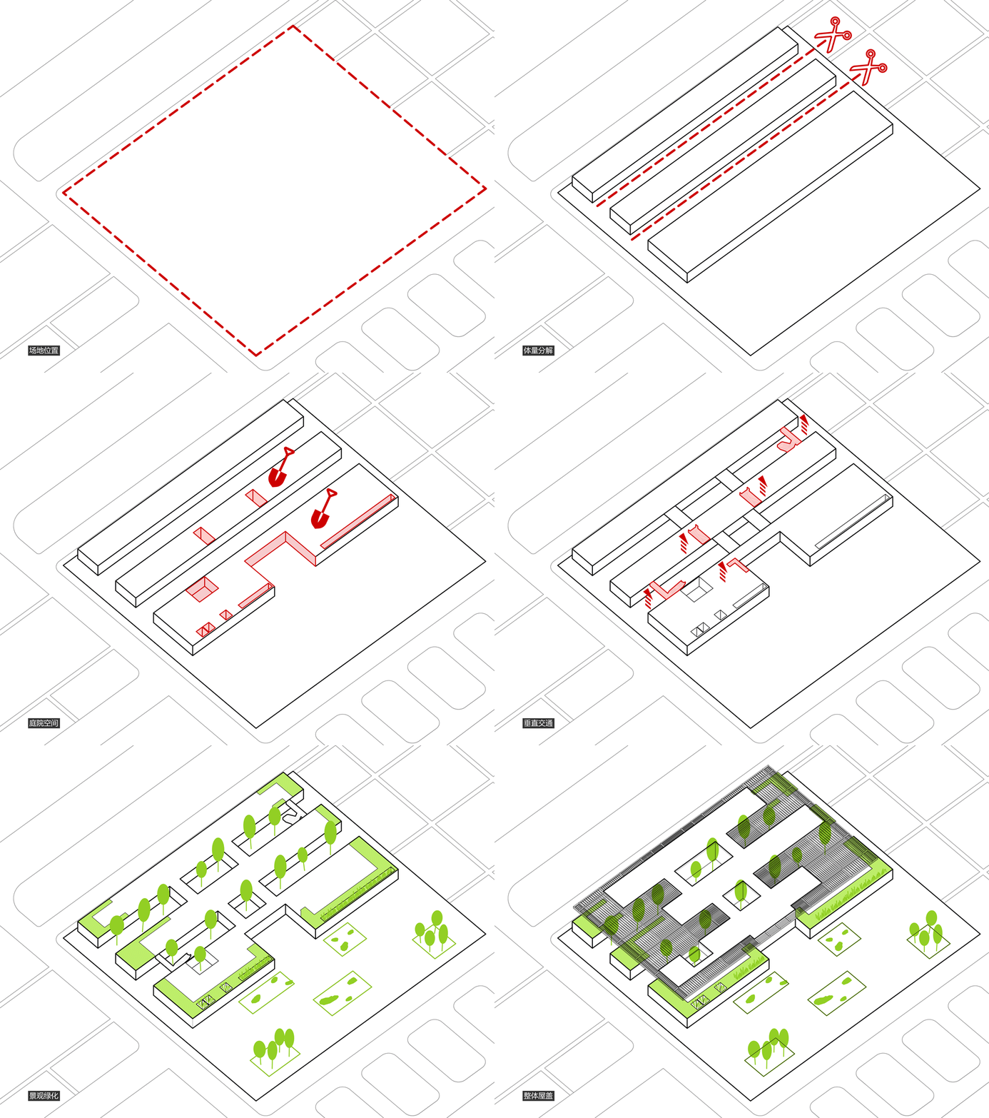
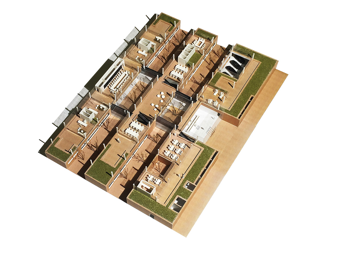
建筑的上下两层会呈现完全不同的空间印象:首层对外封闭内向,二层则开敞外向,从而强调了建筑整体的水平性特征。建筑的外部形象产生类似于中国传统建筑的意向——漂浮的屋顶与厚重的台基,两者之间是自由透明的空间。首层为加高的“台基”部分。两层庭院将“台基”切分为平行的南、中、北三条功能体块,南侧功能块之内也包含着若干小庭院。保证首层所有房间都与庭院相邻,具有良好的采光和多样景观。“台基”之上二层由玻璃幕墙灵活地划分出多尺度的办公和公共空间,使得内部活动可自由的拓展至室外平台。六处连桥水平串联三条功能空间,创造简洁有效的流线路径并进一步划分出几处内向庭院。
The office building consists of two floors, which present totally different visual impressions. 1F is enclosed and inward-facing, while 2F is open and outward-facing. Such contrast highlights the horizontal layout of the overall architectural space. The building has a “floating” rooftop, a solid pedestal and a transparent space in between, which is similar to the image of traditional architectures to some extent. Several two-storey-high courtyards separate 1F into three parallel horizontal functional blocks. In this way, each room on 1F is connected with a courtyard, ensuring ample daylight and forming diversified landscape. Besides, the block on the south itself includes some small-scale courtyards. 2F has a large area of glass curtain walls, which mark off various functional spaces of different scales and also enable indoor activities to be extended to outdoor terraces freely. Six bridges link the three functional blocks of the building, generating efficient circulation routes and further dividing off several inward-facing yards.


2、光影的庭园
II. Play of light and shadows
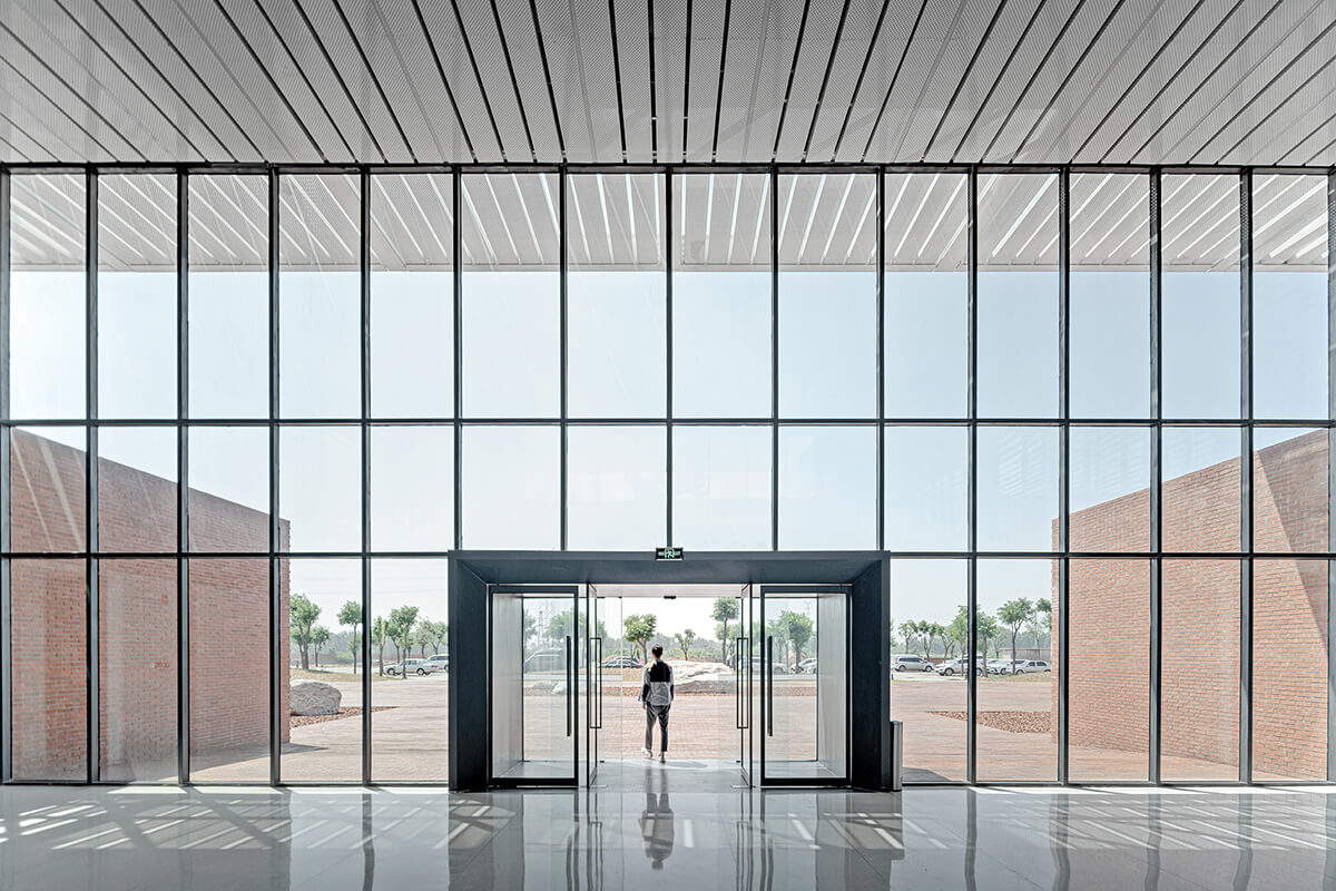
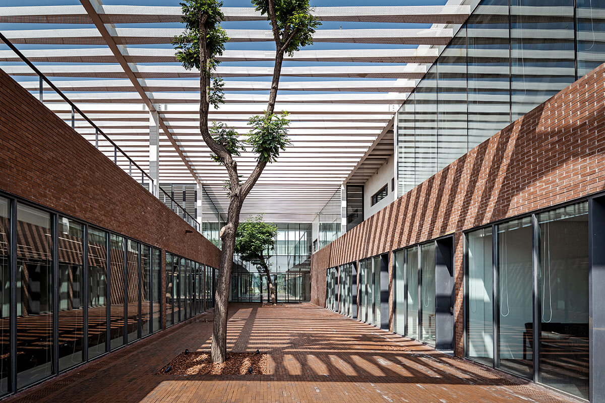
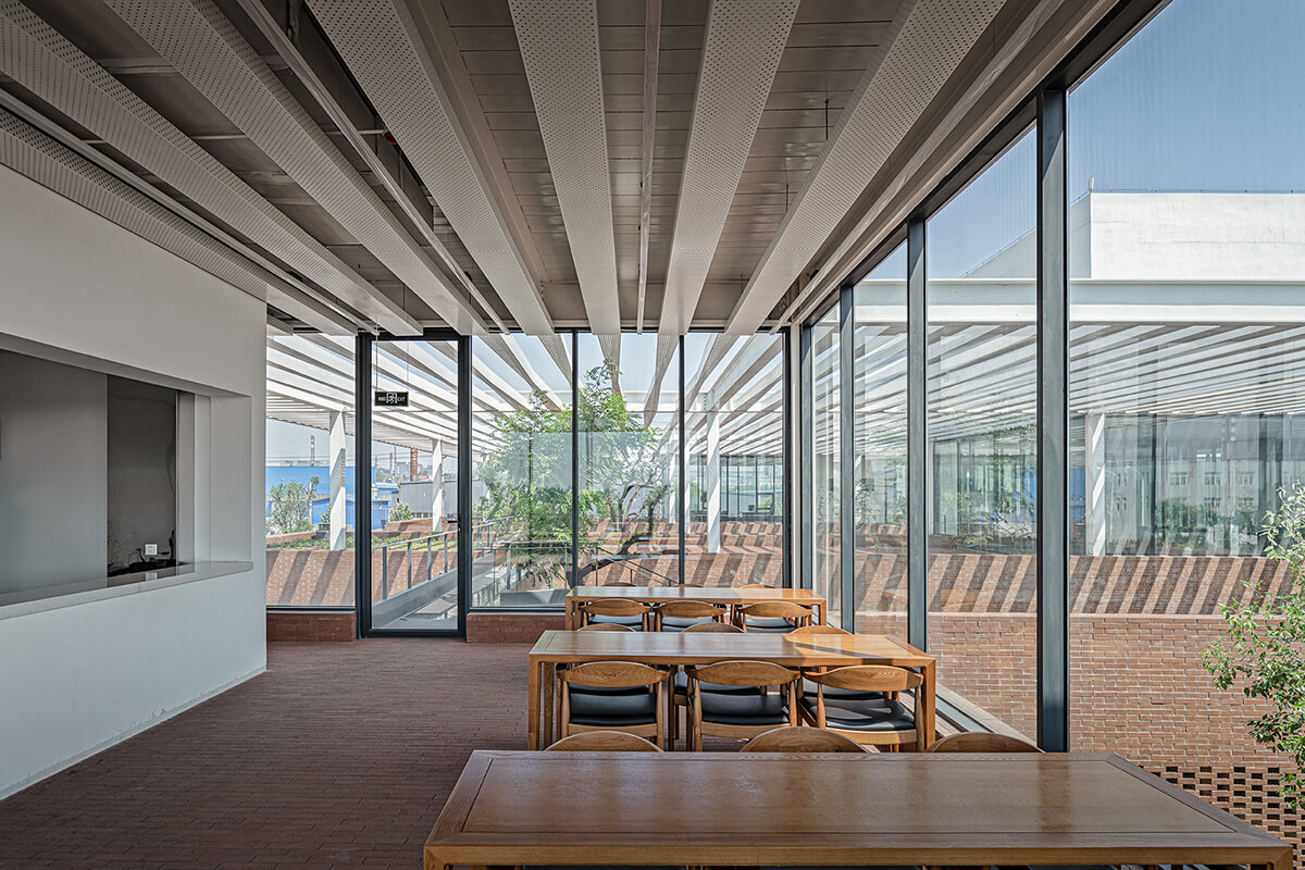
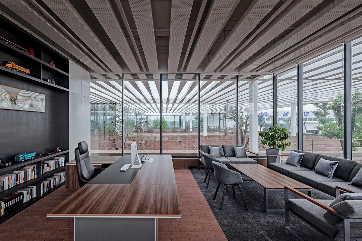
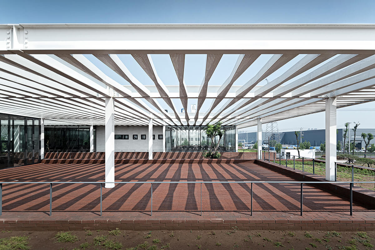
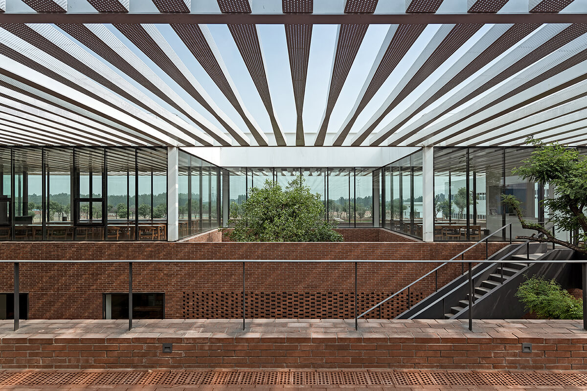
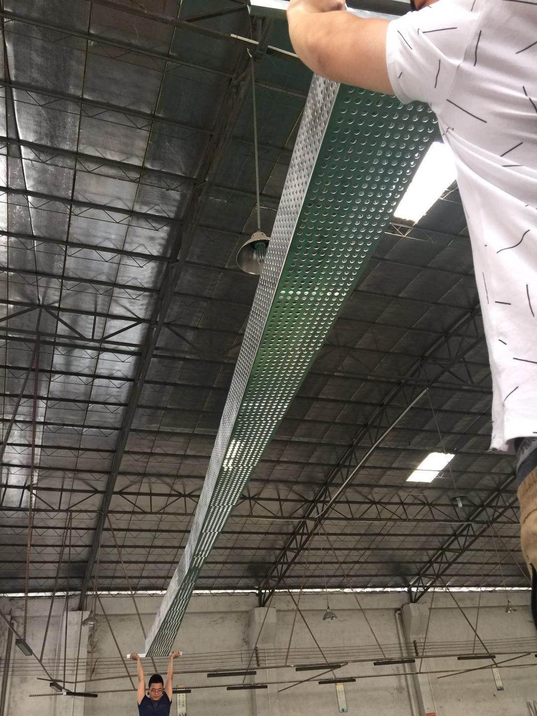
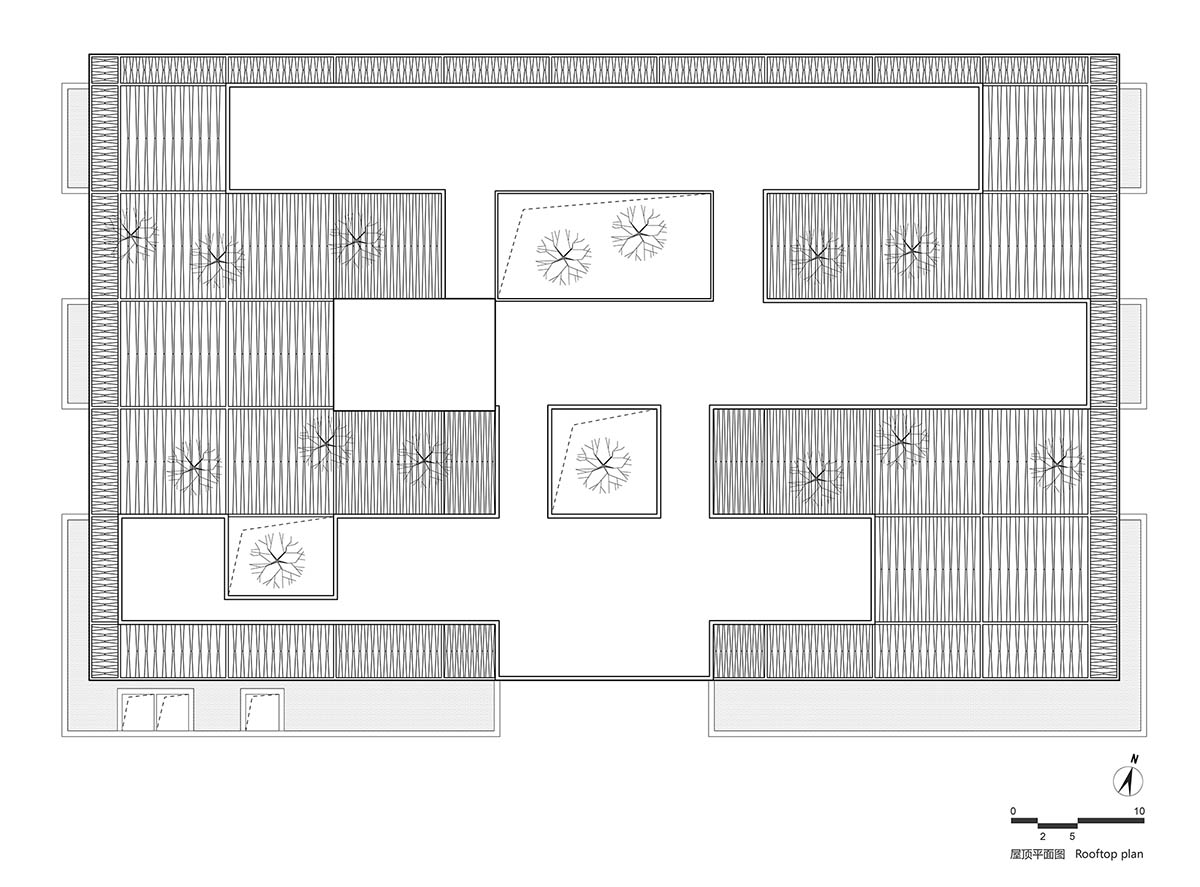
一片面积约4000平米的平屋顶+遮阳格栅覆盖了整个建筑场地。屋顶遮阳格栅设计意象来自于周边农田景观的线性肌理,并结合方格网结构与平直楼板产生“柔化”的效果。遮阳格栅会产生由建筑中心向两边产生由密到疏的渐变排列,每一条格栅本身也存在着弧形的宽度渐变,同时铝制格栅表面穿孔以弱化实体感,由此将钢结构屋面与遮阳系统结合为一个整体的大屋顶。半透明感的屋顶宛如阳光下一片巨大的灯罩,其下的建筑和庭院自然演变为光影的森林。空间跟随着一天之中阳光的变化,光影的韵律交织叠合,与人的活动一起共同演绎生动的自然场景。
The entire architecture is covered by a 4,000-square-meter flat roof and sun-shading grilles formed by aluminum strips. The grilles draw on the linear forms of surrounding farmland, and soften floor slabs. From the building’s middle area to east and west sides, the interspace between aluminum strips gradually decreases. Besides, each aluminum strip features width variations and perforated surfaces. The steel-structured rooftop of the three architectural blocks and the sun-shading grilles together constitute an integrated large roof. It looks like a lampshade with interspaces, which allows light to filter down, and thereby turning the building and courtyard beneath into a “forest” of light and shadows. The varying light brings changes to spaces throughout the day. The rhythmic interplay of light and shadows, as well as human activities, together produce distinctive vivid scenes.


3、复合的场所
III. Multifunctional compound
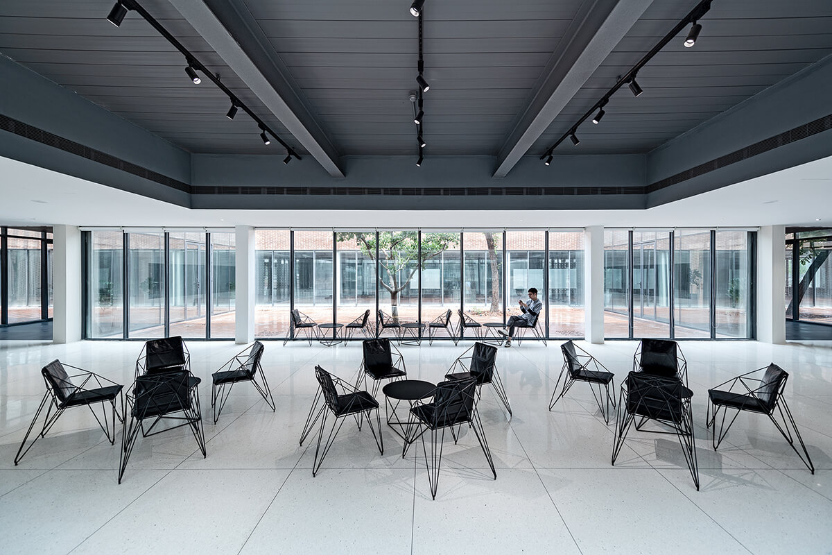
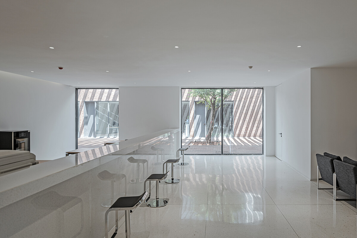
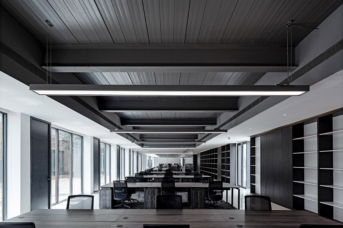
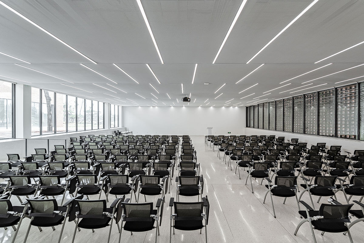
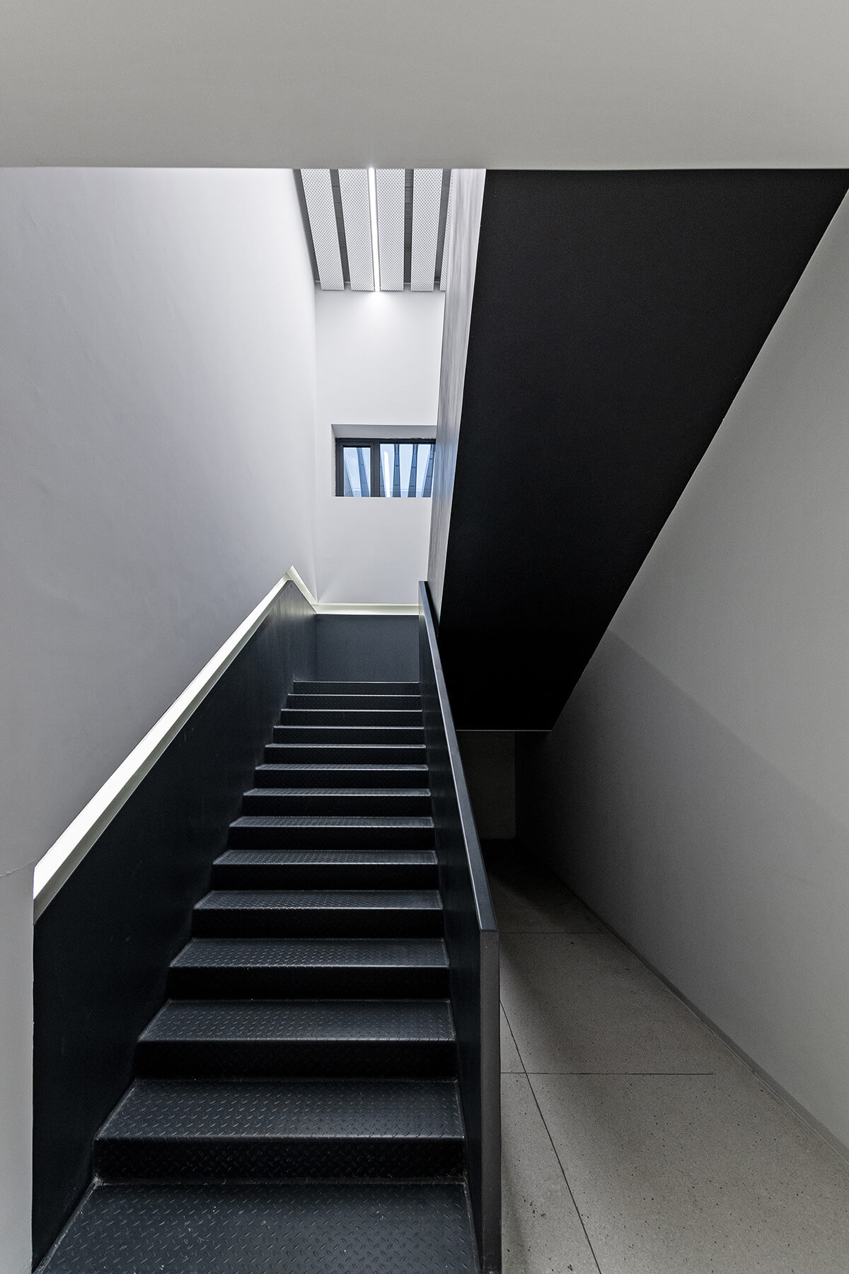
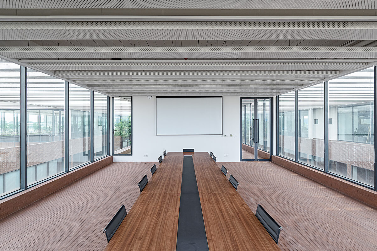
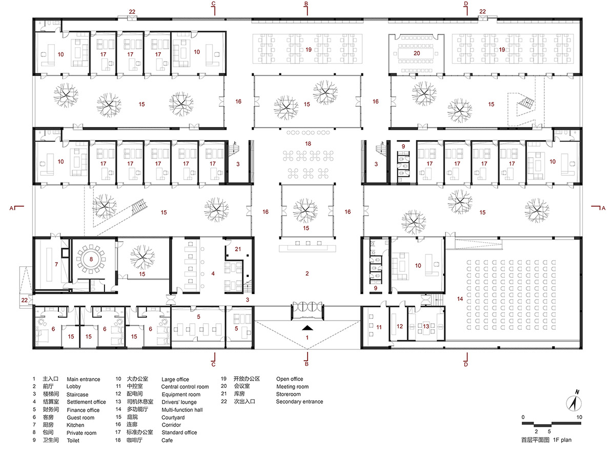
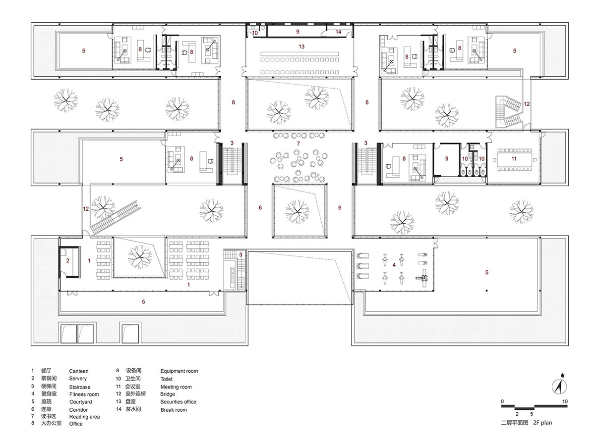
围绕办公建筑的基本特征,结合内外场景衍生出多样复合的工作生活场所。屋檐之下两层通高的入口接待厅正对着前广场,背后依托层层展开的庭院与树木,向用户与访客表现出鲜明的第一印象。建筑首层设置了多种类型的办公空间,包括面向庭院的中、小型办公室、开放办公区、会议室,可容纳300人的多功能厅以及财务室、结算室等。各部门办公区域结合平面进行分区布局,避免相互干扰。在人流路径的结合部设置一些休闲空间,比如面向树院的咖啡厅等,让人们共享惬意的社交、休憩时光。三处室内楼梯和两处室外楼梯连接上下两层,兼顾工作流线的效率与舒适。二层的空间布局更为自由灵活,包括若干大办公室、大会议室、多媒体室以及图书阅览区、健身房、员工餐厅等。大屋顶之下尽量透明的墙面让所有房间均与露台和屋顶花园紧密相邻,光影之下的室内外环境融为一体。
Focusing on the basic characteristics of office buildings and combining indoor and outdoor scenes, ARCHSTUDIO created a multifunctional working and living compound. The double-height reception lobby faces the front court, which presents a striking first impression, with courtyards and trees unfolding at its back. 1F is composed of various working spaces, including small and medium-sized offices, an open working area and a conference room that face courtyards, a multifunction hall that can accommodate 300 people, a finance office, and a settlement office, etc. Working areas of different departments are separated, so as to avoid interference. At the junctions of circulation routes, some leisure areas were set, such as a cafe which faces a courtyard with a tree, with a view to enabling people to communicate or take a break in a relaxing way. Three indoor staircases and two outdoor stair cases lead to 2F, the design of which fully took into account efficiency and smoothness of routes. The space organization on 2F is more flexible, which contains several large offices, an expansive conference room, a multimedia room, a reading area, a fitness room, the staff canteen, etc. The transparent glass walls closely connect each room to outside terraces and roof gardens, and integrate interior and outdoor spaces into a whole.


4、自然的建造
IV. Natural construction
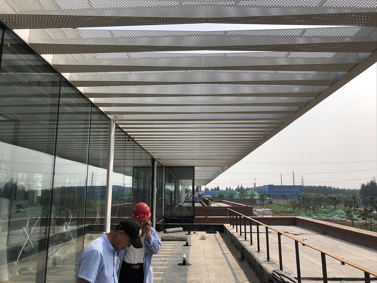
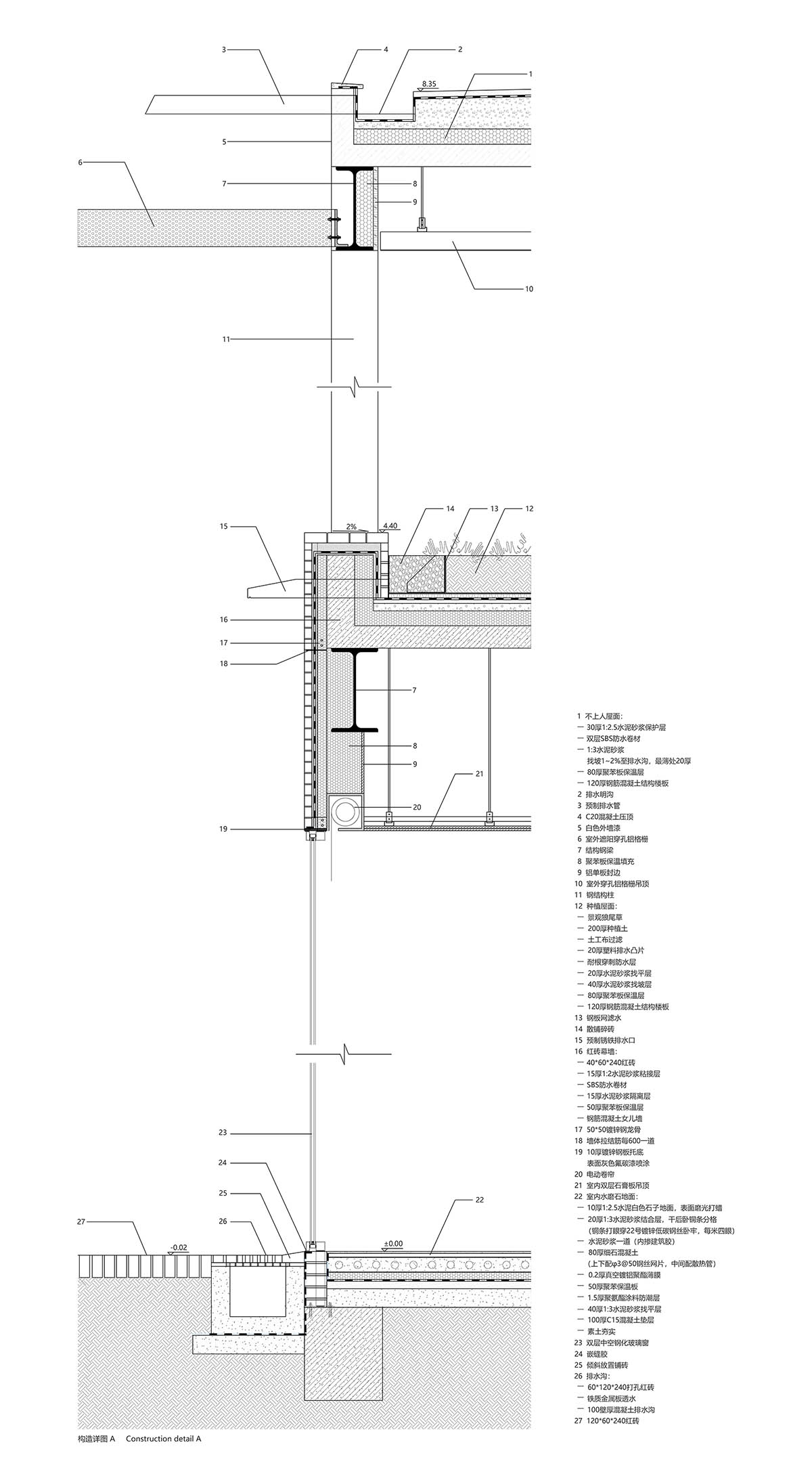
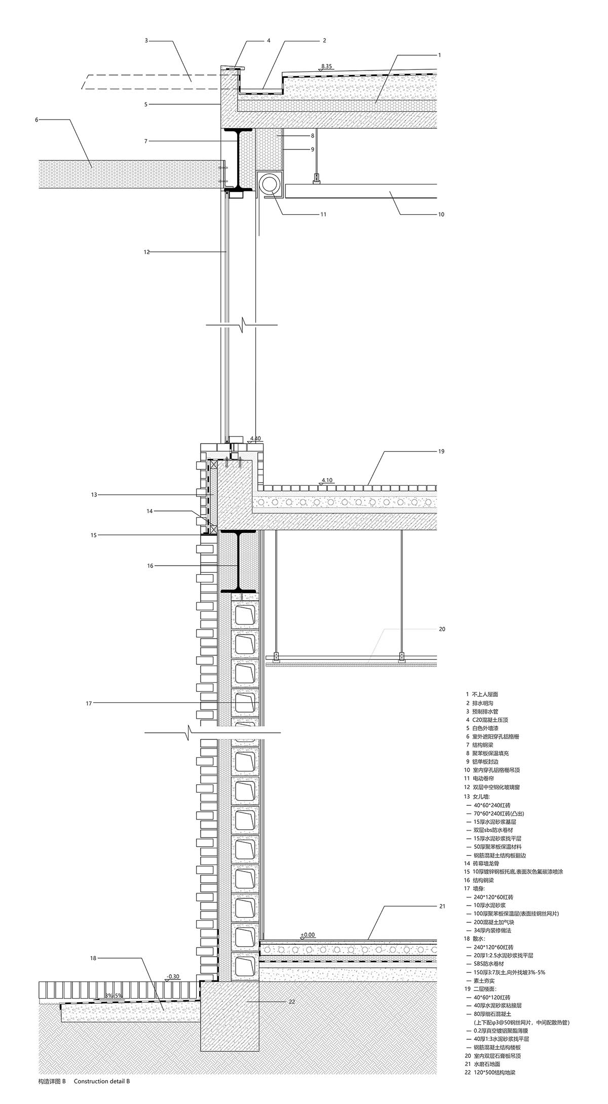
建筑在材料使用上较为克制,注重材料与空间的逻辑关系、内外的一体化以及材料语言自身的表现力。建筑的前广场、首层外墙和二层楼面均使用了红砖这一该地区历史建筑较为典型的材料,结合办公楼建筑形态构成了由南向北连续起伏的砖肌理地表。红砖的砌筑方式与所在位置、开口方式、功能要求密切相关,并在砖地表的不同区域产生凹凸、错叠、渗透等的变化。在砖盒子界面之间,室内外连桥、楼梯、门窗框以及部分室内台面等均采用钢板材料,部分室外地面还做了防滑处理。砖盒子的内部被处理为统一的浅色背景,使用了水磨石、涂料等。在砖盒子之上,二层空间内外均使用穿孔铝制格栅吊顶,照明、空调、设备等管线隐藏其中,形成完整的空间界面,与粗糙的砖表面形成对应。
The office building is characterized by a restrained material palette, which focuses on the logic relationship between materials and space, integration between interiors and exteriors, as well as maximum expression of material languages. The front court, external walls of 1F, and part of the floor on 2F, are clad in red bricks, a type of material commonly seen on local historical architectures. From south to north, the red bricks together present an undulating image based on the architectural form. According to positions, space openings and functional requirements, bricks were laid in different ways, and hence presenting various formations and visual effects. Apart from bricks, steel materials were also repeatedly utilized, which can be found on indoor and outdoor bridges, staircases, door and window frames, and some counter surfaces within the space. Besides, work was done to endow part of the outdoor floor with slip-resistant quality. On 2F, perforated aluminum grilles were used as ceilings of interior spaces and covers of outside areas. Those grilles hide pipes and wires of lighting system, air conditioning and other equipment, which ensures the integrity of spatial interfaces and forms contrast with rough brick surfaces as well.


材料图片
∇ 铝格栅生产 ©建筑营
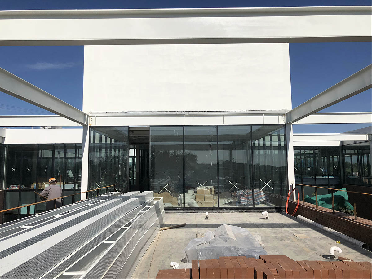
∇ 铝格栅堆放 ©建筑营
∇ 铝格栅安装 ©建筑营
∇ 凹凸砖墙实验 ©建筑营
∇ 镂空砖墙实验 ©建筑营
设计图纸
∇ 分析生成动图
∇ 总平面图
∇ 首层平面图
∇ 二层平面图
∇ 屋顶平面图
∇ 东立面
∇ 南立面
∇ 西立面
∇ 北立面
∇ A-A剖面图
∇ B-B剖面图
∇ C-C剖面图
∇ D-D剖面图
∇ 构造详图A
∇ 构造详图B
∇ 模型照片
∇ 模型照片
完整项目信息
项目名称:鼎石物流办公楼
项目地址:河北,唐山
用地面积:8087平米
建筑面积:4617平米
主要材料:砖、玻璃、铝板、水磨石
设计时间:2017.03—2017.06
施工时间:2018.03—2019.03
设计公司:建筑营设计工作室(www.archstudio.cn)
主持设计:韩文强
建筑设计:姜兆、胡博、蒯新珏、张勇(结构)、郑宝伟、于妍、王甫(水暖电)
室内及景观设计:姜兆、胡博、朱亚伟、黄涛
配合单位:丰润建筑设计所
摄影师:王宁
撰文:韩文强
Project name: Dingshi Logistics Office Building
Location: Tangshan, Hebei, China
Site area: 8,087 m2
Construction area: 4,617 m2
Main materials: brick, glass, aluminum panel, terrazzo
Design phase: March 2017 — June 2017
Construction phase: March 2018 — March 2019
Design firm: ARCHSTUDIO (www.archstudio.cn)
Chief designer: Han Wenqiang
Architectural design: Jiang Zhao, Hu Bo, Kuai Xinyu, Zhang Yong (structure), Zheng Baowei, Yu Yan, Wang Fu (MEP)
Interior & landscape design: Jiang Zhao, Hu Bo, Zhu Yawei, Huang Tao
Coordinating design firm: Fengrun Architecture Practice
Photography: Wang Ning
Text: Han Wenqiang
|


